Untitled from Rustled Jimmies on Vimeo.
Monday, 16 April 2012
Friday, 27 January 2012
Thursday, 26 January 2012
Thursday, 12 January 2012
Digipak and Advert feedback
According to the feedback we received our page design was well done. It used contrast to a good effect, with the background drawing people's eyes to the words on the page. Both the digipak and the advert were commended for their use of colour, although it was noted that the advert seemed a little cramped at the top. This can easily be fixed, by simply moving a few sections of the text, and placing them on different areas of the page. Our use of media terminology and our use of software was also identified as a good point. Our manipulation of the various images such as the the cover symbol, and the inside images, were also claimed to be of a suitable standard.
Tuesday, 10 January 2012
Tuesday, 3 January 2012
Digipak and Advert Final Drafts

The final draft of the advert.
This is the final draft of the digipak interior.
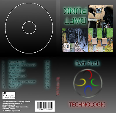
The final draft of the digipak cover.

This is the finished digipak, with both the interior and the exterior sections stitched together. This creates a realistic looking digipak, that reflects conventions of the music industry. It also reflects similar conventions of Daft Punk album covers, as some of their albums have contained ambiguous symbols, or images with various effect filters added to them.
Subscribe to:
Comments (Atom)

