Untitled from Rustled Jimmies on Vimeo.
(2nd) G324 Advanced Portfolio for Media
Monday, 16 April 2012
Friday, 27 January 2012
Thursday, 26 January 2012
Thursday, 12 January 2012
Digipak and Advert feedback
Tuesday, 10 January 2012
Tuesday, 3 January 2012
Digipak and Advert Final Drafts

Monday, 12 December 2011
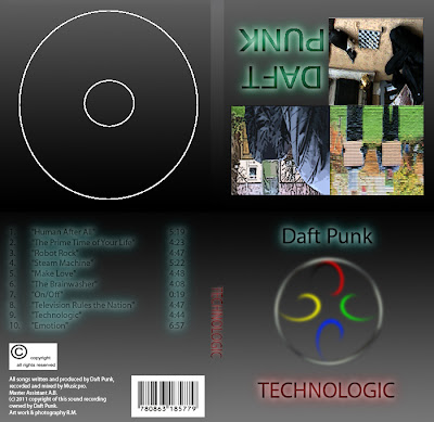
Digipak and advert drafts
Monday, 31 October 2011
Rough Cut
Thursday, 20 October 2011
Recce Shots - Costumes


Tuesday, 18 October 2011
Monday, 17 October 2011
Friday, 14 October 2011
Thursday, 13 October 2011
Friday, 30 September 2011
Tuesday, 27 September 2011
Daft Punk - Technologic lyric breakdown.
(0:09) Trash it, change it, mail - upgrade it, (0:10) (1 second)
(0:11) Charge it, pawn it, zoom it, press it, (0:12) (1 second)
(0:12) Snap it, work it, quick - erase it, (0:14) (2 seconds)
(0:14) Write it, cut it, paste it, save it, (0:16) (2 seconds)
(0:16) Load it, check it, quick - rewrite it, (0:18) (2 seconds)
(0:18) Plug it, play it, burn it, rip it, (0:20) (2 seconds)
(0:20) Drag and drop it, zip - unzip it, (0:22) (2 seconds)
(0:22) Lock it, fill it, call it, find it, (0:24) (2 seconds)
(0:24) View it, code it, jam - unlock it, (0:26) (2 seconds)
(0:26) Surf it, scroll it, pause it, click it, (0:27) (1 second)
(0:28) Cross it, crack it, switch - update it, (0:29) (1 second)
(0:29) Name it, rate it, tune it, print it, (0:31) (2 seconds)
(0:31) Scan it, send it, fax - rename it, (0:33) (2 seconds)
(0:33) Touch it, bring it, Pay it, watch it, (0:35) (2 seconds)
(0:35) Turn it, leave it, start - format it. (0:37) (2 seconds)
(0:38) Technologic [4x] (0:44) (6 seconds)
(0:44) Buy it, use it, break it, fix it, (0:46) (2 seconds)
(0:46) Trash it, change it, mail - upgrade it, (0:48) (2 seconds)
(0:48) Charge it, pawn it, zoom it, press it, (0:50) (2 seconds)
(0:50) Snap it, work it, quick - erase it, (0:52) (2 seconds)
(0:52) Write it, cut it, paste it, save it, (0:54) (2 seconds)
(0:54) Load it, check it, quick - rewrite it, (0:56) (2 seconds)
(0:56) Plug it, play it, burn it, rip it, (0:58) (2 seconds)
(0:58) Drag and drop it, zip - unzip it, (1:00) (2 seconds)
(1:00) Lock it, fill it, call it, find it, (1:01) (1 second)
(1:01) View it, code it, jam - unlock it, (1:03) (2 seconds)
(1:03) Surf it, scroll it, pause it, click it, (1:05) (2 seconds)
(1:05) Cross it, crack it, switch - update it, (1:07) (2 seconds)
(1:07) Name it, rate it, tune it, print it, (1:09) (2 seconds)
(1:09) Scan it, send it, fax - rename it (1:11) (2 seconds)
(1:11) Touch it, bring it, pay it, watch it, (1:13) (2 seconds)
(1:13) Turn it, leave it, start - format it. (1:14) (1 second)
(1:15) Buy it, use it, break it, fix it, (1:16) (1 second)
(1:16) Trash it, change it, mail - upgrade it, (1:18) (2 seconds)
(1:18) Charge it, pawn it, zoom it, press it, (1:20) (2 seconds)
(1:20) Snap it, work it, quick - erase it, (1:22) (2 seconds)
(1:22) Write it, cut it, paste it, save it, (1:24) (2 seconds)
(1:24) Load it, check it, quick - rewrite it, (1:26) (2 seconds)
(1:26) Plug it, play it, burn it, rip it, (1:28) (2 seconds)
(1:28) Drag and drop it, zip - unzip it (1:29) (1 second)
(1:30) Touch it, bring it, pay it, watch it, (1:31) (1 second)
(1:32) Turn it, leave it, start - format it. (1:33) (1 second)
(1:37) Touch it, scroll it, pause it, click it, (1:39) (2 seconds)
(1:39) Cross it, crack it, switch, update it. (1:41) (2 seconds)
(1:45) Surf it, scroll it, pause it, click it, (1:46) (1 second)
(1:47) Cross it, crack it, switch-update it. (1:48) (1 second)
(1:48) Name it, rate it, tune it, print it, (1:50) (2 seconds)
(1:50) Scan it, send it, fax-rename it. (1:52) (2 seconds)
(1:52) Touch it, bring it, pay-watch it, (1:54) (2 seconds)
(1:54) Turn it, leave it, start-format it. (1:56) (2 seconds)
(1:56) Buy it, use it, break it, fix it, (1:58) (2 seconds)
(1:58) Trash it, change it, mail - upgrade it, (2:00) (2 seconds)
(2:00) Charge it, pawn it, zoom it, press it, (2:02) (2 seconds)
(2:02) Snap it, work it, quick - erase it, (2:03) (1 second)
(2:03) Write it, cut it, paste it, save it, (2:05) (2 seconds)
(2:06) Load it, check it, quick - rewrite it, (2:07) (1 second)
(2:07) Plug it, play it, burn it, rip it, (2:09) (2 seconds)
(2:09) Drag and drop it, zip - unzip it, (2:11) (2 seconds)
(2:11) Surf it, scroll it, pause it, click it, (2:13) (2 seconds)
(2:13) Cross it, crack it, switch-update it. (2:15) (2 seconds)
(2:15) Name it, rate it, tune it, print it, (2:17) (2 seconds)
(2:17) Scan it, send it, fax-rename it. (2:18) (1 second)
(2:19) Touch it, bring it, pay-watch it, (2:20) (1 second)
(2:20) Turn it, leave it, start-format it. (2:22) (2 seconds)
(2:22) Buy it, use it, break it, fix it, (2:24) (2 seconds)
(2:24) Trash it, change it, mail - upgrade it, (2:26) (2 seconds)
(2:26) Charge it, pawn it, zoom it, press it, (2:28) (2 seconds)
(2:28) Snap it, work it, quick - erase it, (2:30) (2 seconds)
(2:30) Write it, cut it, paste it, save it, (2:32) (2 seconds)
(2:32) Load it, check it, quick - rewrite it, (2:34) (2 seconds)
(2:34) Plug it, play it, burn it, rip it, (2:35) (1 second)
(2:36) Drag and drop it, zip - unzip it, (2:37) (1 second)
(2:37) Surf it, scroll it, pause it, click it, (2:39) (2 seconds)
(2:40) Cross it, crack it, switch-update it. (2:41) (1 second)
(2:41) Name it, rate it, tune it, print it, (2:43) (2 seconds)
(2:43) Scan it, send it, fax-rename it. (2:45) (2 seconds)
(2:46) Technologic X4 (2:53) (7 seconds)
Monday, 26 September 2011
Friday, 23 September 2011
Thursday, 22 September 2011
Audience Profile.
House music originated in Chicago, Illinois USA, and was popularised in the mid 1980’s. It has since been infused into mainstream media. Various artists such as Daft Punk, and Fat Boy Slim deal with this style of music.
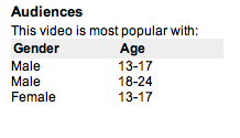
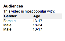
Our video will be targeted towards these categories of people. The above screenshots were taken from two videos from the house category, namely Daft Punk’s Technologic, and Harder, Better, Faster, Stronger. As you can see from the screenshots, they show that ‘house’ genre music seems to be most popular with males from the ages of 13- 24. We expect that the people we will appeal to will be mainly fans from this genre of music, or people who have heard these songs before.
Fans of this music are usually fans of other club music, such as hip-hop. While it is popular with both males and females, the above information mainly centres on the male side. This type of music would probably not be appreciated by people at an older age, say around the 50’s, as club music is usually a thing for the younger generation.
Thursday, 15 September 2011
Proof of email request.
Tuesday, 13 September 2011
Advert Analysis

First thing that I pick up on with this advert is that the title is “keep calm and carry on”. The picture depicts the band in a situation where they are adhering to the title and not doing anything to get out of the water. They are just sitting there eating what looks to be breakfast and not bothering to notice the surroundings. The actual writing about the album is written in white and placed over the water so that it stands out better to the audience. The general colour tone seems to be dark as the band are dressed in dark clothes, the sky is grey and the only thing in bright colour is the table with the food on. This could have been done to grab the audience’s attention as they search for meaning into the “keep calm and carry on” title.
Video Analysis
Narrative
There doesn’t appear to be much of a narrative, however there does appear to be some allusion to it being about a man trying to acquire a certain female. Throughout the video he is seen to dancing and making romantic gestures to a woman (he carries flowers, she is later seen holding the flowers.) Towards the end of the video the man is seen to change from being a more upper class person, to a person who better resembles the genre. There also appears to be hints that the woman he is after is some sort of vampire, as at one point she is seen leaning in to bite his neck, and then after that he transforms to look more suited to the genre and her.
Performance
The performance of the video mainly shows the male’s transition from upper class male to free (possibly vampiric) male. The video cuts between shots of women dancing in a seductive manner, to shots that resemble the narrative. However at one point the narrative and the performance seem to blend together as he is seen dancing with the woman, whilst also singing with her.
Thought Beats
The music has a constant beat in the background, at certain points a light flashes, possibly to simulate lightning, this is timed perfectly with the beats.
The cuts in the song are also timed well with the song beats, and even some of the camera movements. Sometimes the camera zooms in and out, and this is cut well to the music.
Visuals linked to the song
There is a point where the male says, “don’t hurt me no more”. He is seen gesturing to some woman who is possibly outside of the shot.
There is also a point where he says, “Give me a sign”. As he says that, he proceeds to pull a strange sign with his fingers and hand. This is possibly the sign that he wanted her to use.
Technical aspects of the video
The way that some of the dancers, and the singer is dressed is rather provocative. The women are dressed in pretty bare clothing, which is mainly concealed by a cape. The male singer is seen to be wearing an open jacket, with no shirt underneath, showing off his chest. This may have caused people to feel offended at the way they are dressed.
The colour palette of the video is dark and sinister. This alludes to the idea that it is meant to be a sort of gothic feel to the video. Which also links to the idea that the female dancer seen dancing with the male singer is a vampire, as vampire’s are commonly found in gothic horror.
Monday, 12 September 2011
Nine Frame Analysis
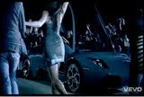
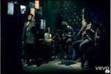

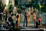
No1: 0:18
This shot consists of a crowd at a concert, being made up of cardboard cut outs and real people. This shows the beginning of the narrative; (the narrative shows their rise to fame via certain situations that are usually shown with fame.) At one point in the video a member of the band pulls out a phone and plays a sound, the actual songs start is then played when he presses play.
No2: 0:20
This scene is shot at night and therefore dark, showing a crowd of real people crowding round a sports car. Another member of the band is scene walking towards the car ignoring all of his “fans” and getting in. The scene continues the rise to fame theme as fast cars are usually something that come with fame and fortune.
No3: 0:29
The next scene is a dark scene with a spotlight centered on the band in a recording studio. The band are recording with another huge star (shown to be a hip-hop producer.) This continues the narrative, as collaborations are something else that famous singers get to do. The scene is also reminiscent of stereotypes pertaining to underground cultures such as rap and hip-hop.
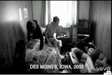
No4: 1:38
The next scene shows the band in hotel room having a wild party. The lighting in the scene is bright showing a posh hotel suite and the band playing at various points in the room. The narrative is continuing as rock stars are famed for throwing wild parties in hotels and breaking things.
No5: 1:49
The next scene shows one of the band members at a modeling shoot. The scene is darkened with the lights focused on the model. The narrative is continued in the way that some stars, when they gain enough popularity, get to go too a photo-shoot. The scene also is based upon a real life event involving one of the guitarists.
No6: 2:14
The next scene is a rip off of the playboy mansion, which is another thing that famous people get to do as they gain fame. The scene is set at night and dark with all the light coming from artificial lights around a pool. It shows various members of the band chatting to numerous pretty women around the pool with one of them appearing on a magazine after this scene.
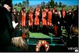
No7: 3:03
The next scene is set a funeral which everyone is wearing black and red apart from a few people e.g. spacemen and others. The scene is shot in colour as opposed to a dull setting. This seems to represent the end of their fame and fortune adventure. A few people in the crowd are actually people from previous FOB videos, such as antler boy from "Sugar, we're going down". Also certain celebrities such as Seth Green appear as well.
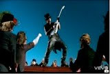
No8: 3:21
The next scene is of a guitarist playing a solo upon a casket. This is the final part of their rise to fame and is almost a tribute to the dead guitar player. The scene is shot at the funeral and is still bright and cheerful which doesn’t suit a funeral at all. This scene seems to be taken from either a Guns 'N Roses video or Avenged Sevenfold video who have both done a scene with someone playing guitar on top of a casket.
No9: 3:33
Album Digipak Analysis

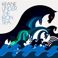
Front
The images used on the front are of sea monsters, which link to the title of the title “under the iron sea”. As in many myths and folklore, sea monsters are commonly found under the sea.
The monsters themselves are divided up into groups, with three black ones looking evil, two that look like they are upset/crying and finally one that looks moderately angry. This adds a degree of emotion to the cover and at the same time it puts this emotion onto varying degrees, depending on the amount of monsters there are displaying that specific emotion. The text on the title goes along with the sea theme by keeping the album name in blue, however the name of the band is in black, this can be linked to the dominant seahorse (the black one).
Back
The back of the cover is just a continuation of the monsters and the waves; same colours are just and just layered on top of each other. There is no text on the back of the cover just the waves and the backs of the sea monsters. However the sea monsters are less defined and it is hard to distinguish between which monster is which.
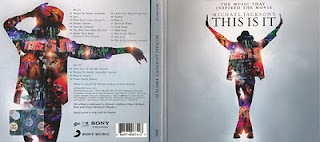
Front
The front of the digipak shows an image of Michael Jackson, striking a pose, most likely taken from one of his dance routines. The titles are positioned so that they stand out to the viewer by having them in a large font, and positioned in the centre of the of Michael's arms. The picture is formed of shrunken down pictures, that appear to be taken from tour dates. This has a sort of tribute effect, as it is showing some of his greatest moments with his fans. The background helps to make these images stand out, given that it is just a plain grey/silver background. Thus the colour of the photo's making up Michael's image are the centre of attention for the viewer.
Back
The back of the digipak contains the same format as the front, with Michael in a different pose, probably a more recognizable one amongst his fans. The image of Michael is still a collage of smaller pictures from tours and other live shows. One of the main differences between the front cover and the back cover is, that the back cover has more text than the front. The back has the track listings, which are separated about the middle because of Michael's arm. The text continues underneath his arm, until all the tracks have been listed. At the bottom of the page are the barcodes and other record labels that have contributed the songs to the album.


