
Front
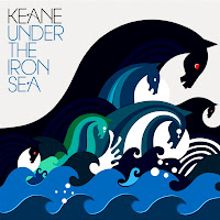
The images used on the front are of sea monsters, which link to the title of the title “under the iron sea”. As in many myths and folklore, sea monsters are commonly found under the sea.
The monsters themselves are divided up into groups, with three black ones looking evil, two that look like they are upset/crying and finally one that looks moderately angry. This adds a degree of emotion to the cover and at the same time it puts this emotion onto varying degrees, depending on the amount of monsters there are displaying that specific emotion. The text on the title goes along with the sea theme by keeping the album name in blue, however the name of the band is in black, this can be linked to the dominant seahorse (the black one).
Back
The back of the cover is just a continuation of the monsters and the waves; same colours are just and just layered on top of each other. There is no text on the back of the cover just the waves and the backs of the sea monsters. However the sea monsters are less defined and it is hard to distinguish between which monster is which.

Front
The front of the digipak shows an image of Michael Jackson, striking a pose, most likely taken from one of his dance routines. The titles are positioned so that they stand out to the viewer by having them in a large font, and positioned in the centre of the of Michael's arms. The picture is formed of shrunken down pictures, that appear to be taken from tour dates. This has a sort of tribute effect, as it is showing some of his greatest moments with his fans. The background helps to make these images stand out, given that it is just a plain grey/silver background. Thus the colour of the photo's making up Michael's image are the centre of attention for the viewer.
Back
The back of the digipak contains the same format as the front, with Michael in a different pose, probably a more recognizable one amongst his fans. The image of Michael is still a collage of smaller pictures from tours and other live shows. One of the main differences between the front cover and the back cover is, that the back cover has more text than the front. The back has the track listings, which are separated about the middle because of Michael's arm. The text continues underneath his arm, until all the tracks have been listed. At the bottom of the page are the barcodes and other record labels that have contributed the songs to the album.
No comments:
Post a Comment